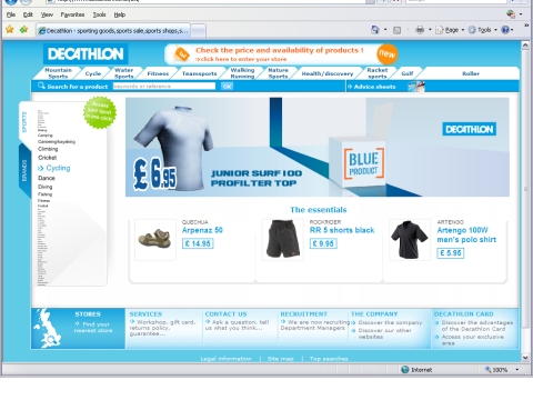
A sporting attempt at dealing with too many navigation items
Decathlon the sports superstore are keen to provide customers with one click access to the products for their sport. However, being a superstore there are a huge number of sports they cater for. Raising two fingers to accessibility – they have decided to cram all of the navigation onto the home page by making it so small you can’t read it !! Madness? not quite – moving your mouse over the list increases the size of the nearest menu options to legible size . See for yourself at:
http://www.decathlon.co.uk/EN/
Screenshot below:
SImon

I think it’s still madness! When I think of navigation and some of it’s principle functions – to tell you where you are and where you can go, the decathalon menu fails on both. Novel, yes – will it catch, I doubt it. Oh, it’s also a Flash based menu – what would John Clifford say!
Kalpesh